


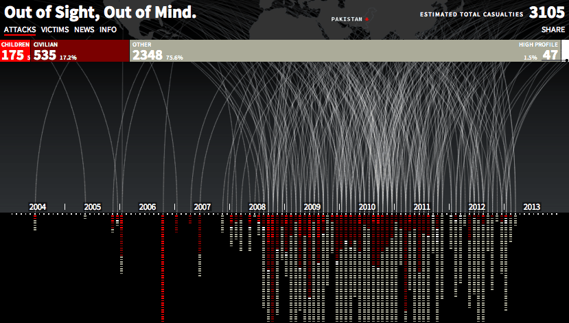
A new info-graphic from design group Pitch Interactive charts the causalities of drone attacks in Pakistan on a timeline dating back to 2004. The interactive chart pulls in data from the Bureau of Investigative Journalism and the New America Foundation and shows the number of fatalities (and identifies who was killed—high profile targets, combatants, civilians or children), the location of the attacks and when they took place. As the Economist points out, there is a noticeable spike in attacks in late 2009, when the drone program was ramped up …